
The Butterfly CFI
Visit the live site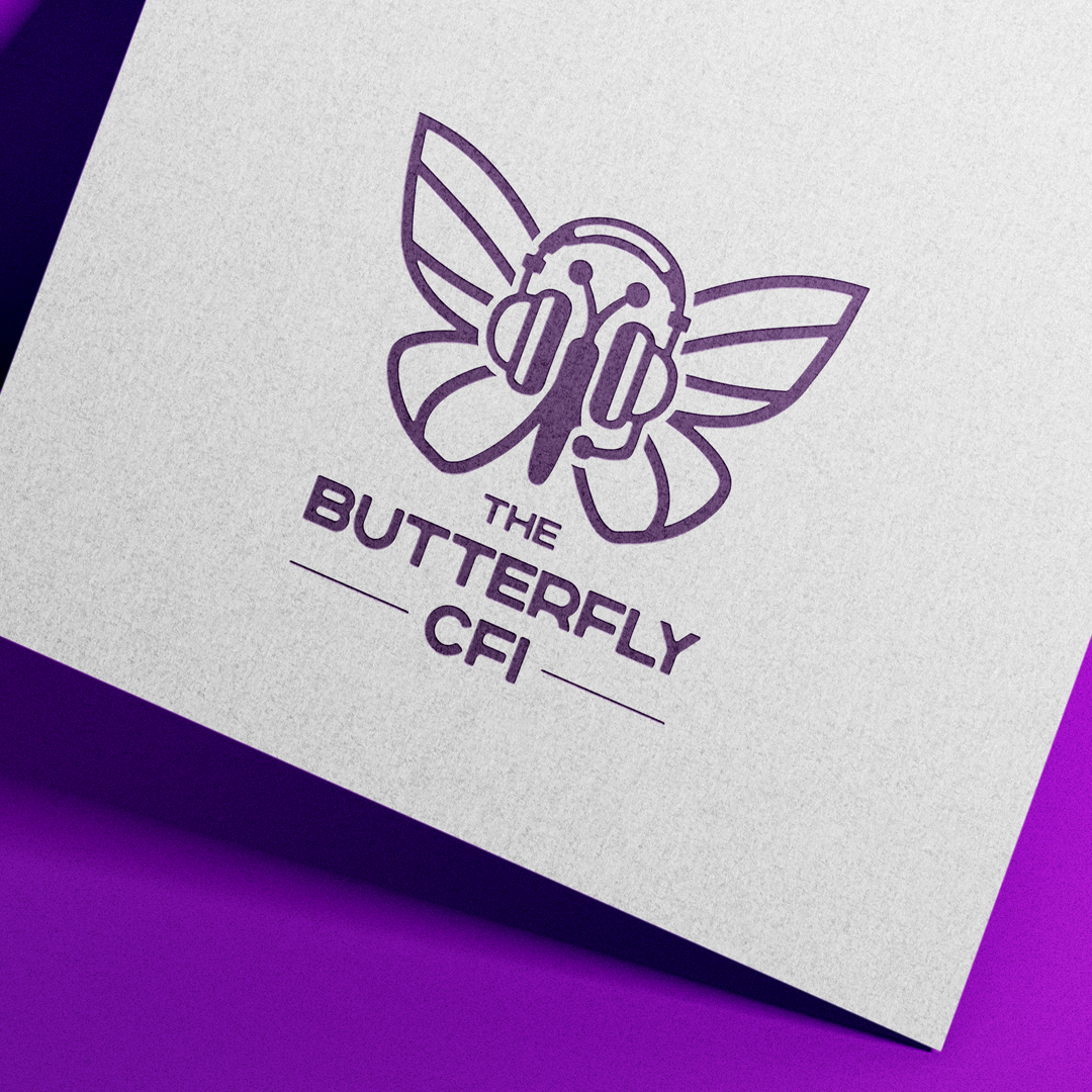
Overview
The Butterfly CFI is a Seattle flight school built around a different kind of student: adults starting later, women, LGBTQIA+ pilots, and anyone who's been burned by a bad instructor or intimidated by the math. Jenn was building the brand and audience before her CFI certification was even finalized.
Platform
- Webflow
Delivery
- Cloudflare
Marketing
- Lead-magnet PDF
- Single-CTA landing page
- 7-email nurture sequence
The Problem
Jenn needed a brand and a site that could build an audience before she had anything to sell — no aircraft, no bookings yet, just the promise of a different kind of instruction.
Key challenges included:
- No brand identity yet, and the target audience is underserved by typical flight-school marketing
- Jenn's own rocky path through flight training (inconsistent instructors, being used for logbook hours) needed to become the differentiator, not a liability
- Had to warm an audience months ahead of being able to actually teach anyone
The Solution
Built the brand from the ground up, then wrapped it in a full pre-launch marketing system instead of just a website.
Brand & Logo
A white butterfly built from headphone shapes — nature and tech in one negative-space mark, monochromatic and deliberately not cartoonish.
Website
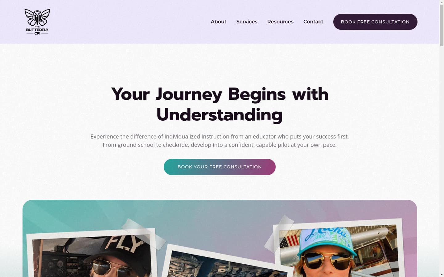
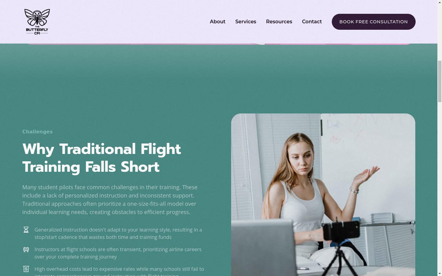
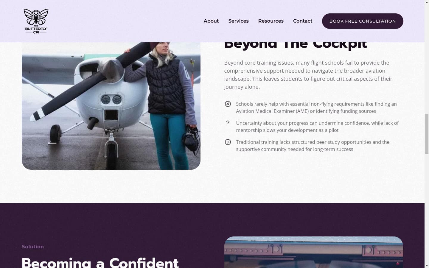
A Webflow site (Home, About/Founder, What Sets Us Apart, Start Your Aviation Journey, Learning Resources) built around Jenn's own training story as the trust signal.
Lead Generation
A lead-magnet PDF ("From Dreams to Wings"), a single-CTA landing page, and a 7-email nurture sequence built on a value-first framework — welcome/story, cost breakdown, learning-style mismatch, community, a student success story, and a consultation CTA.
Under the Hood
A mark that reads at favicon size
The logo is a white butterfly whose wings are formed from headphone shapes, so nature and instruction sit in one negative-space mark. It is monochromatic and deliberately not illustrative, because a flight instructor's brand ends up on a business card, a social avatar, and a browser tab, and a detailed mark stops being legible at every one of those sizes.
Site architecture built around trust, not services
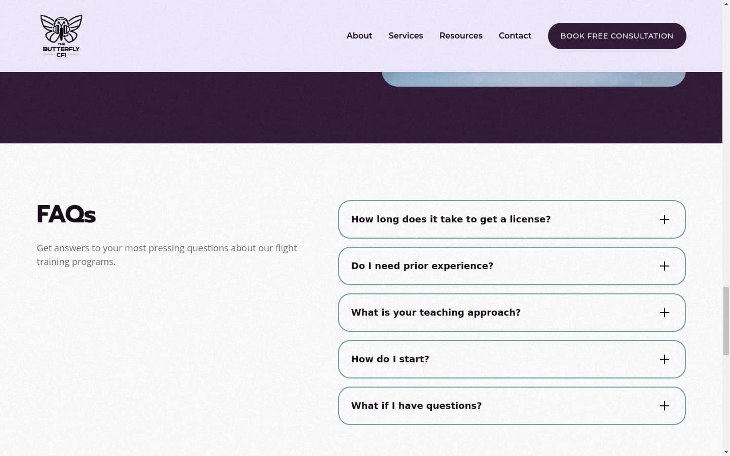
The page structure opens on the founder's own training story. A service list is the obvious move and the wrong one here, because the audience is people who were burned by a previous instructor or talked out of flying entirely. Home, About and Founder, What Sets Us Apart, Start Your Aviation Journey, and Learning Resources are ordered as an objection-handling sequence: who you are, why you are different, and only then what to do next.
One call to action per page
The lead-magnet landing page carries a single action and nothing else, no navigation competing for the click. The seven-email sequence that follows is ordered by objection: welcome and story, what it really costs, why a learning-style mismatch is usually the real problem, community, a student's outcome, and only then a consultation ask.
Timeline
- Jul 2024: Kickoff
- Aug 2024: Site and brand shipped
- Nov 2024: Logo published to social
The Outcome
The full system — brand, site, lead magnet, and email sequence — shipped to production ahead of Jenn's certification, giving her an audience to launch to instead of starting from zero.