
Kobase
Overview
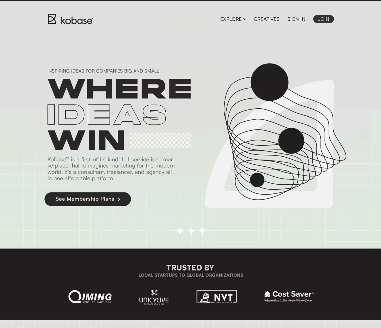
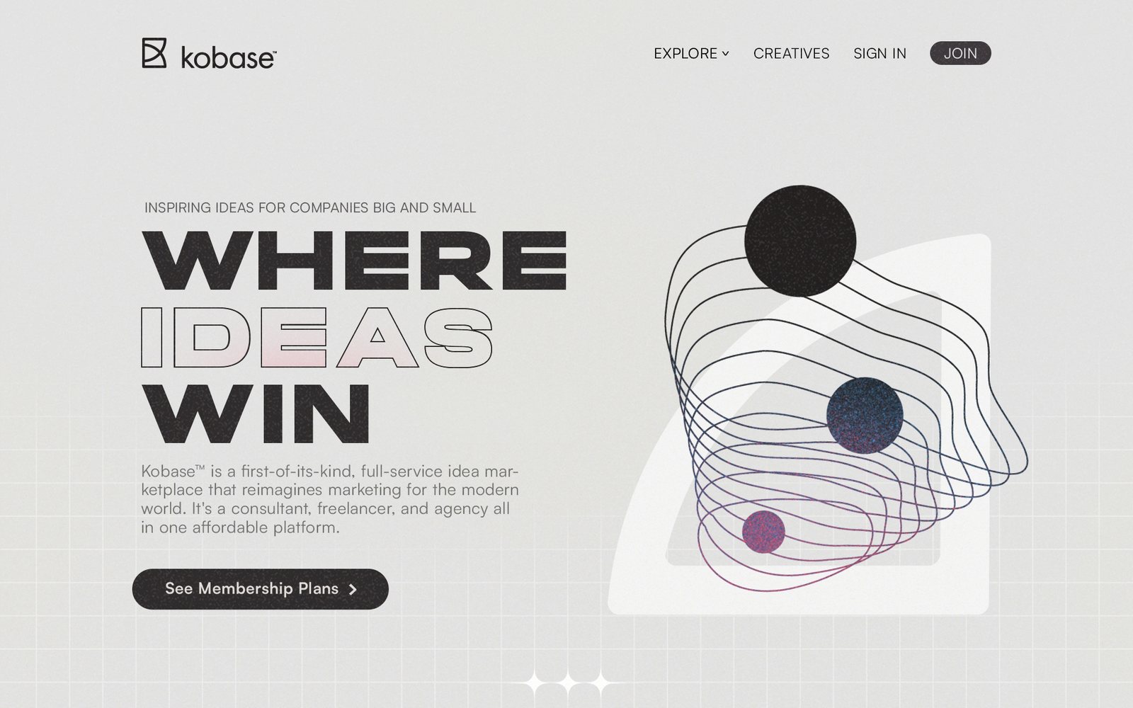
"Where Ideas Win" — Kobase pitched itself as a first-of-its-kind idea marketplace for consultants, freelancers, and agencies. The brief was a landing page built to sell that pitch.
Design
- Figma
- Illustrator
Build
- Webflow
Motion
- Lottie (scroll-triggered)
The Problem
A landing page for a brand-new category needs to explain what it is and sell membership in the same breath.
Key challenges included:
- No existing visual identity to build from — everything (grid, grain texture, type scale, components) had to be built from scratch
- Needed to carry a full narrative arc — problem, solution, benefits, proof, pricing — without losing the reader
The Solution
A full landing page built section by section in Figma, then in Webflow, with a custom visual system underneath.
Structure
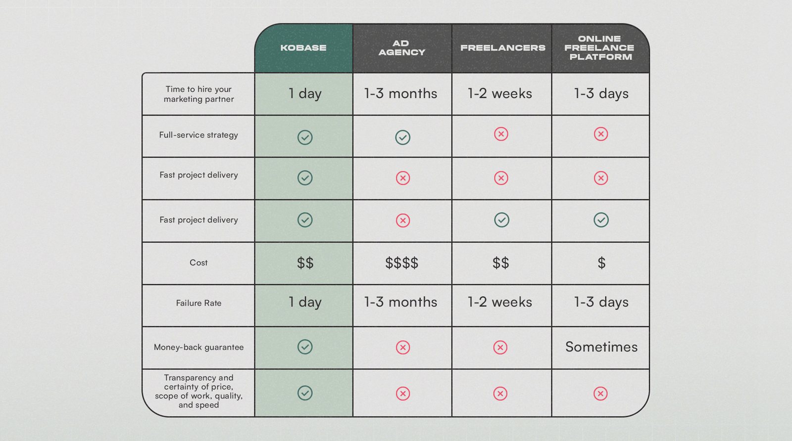
Hero, problem/solution with video, three core benefits, testimonials, features, a membership pricing table, FAQ, and a closing CTA.
Visual System
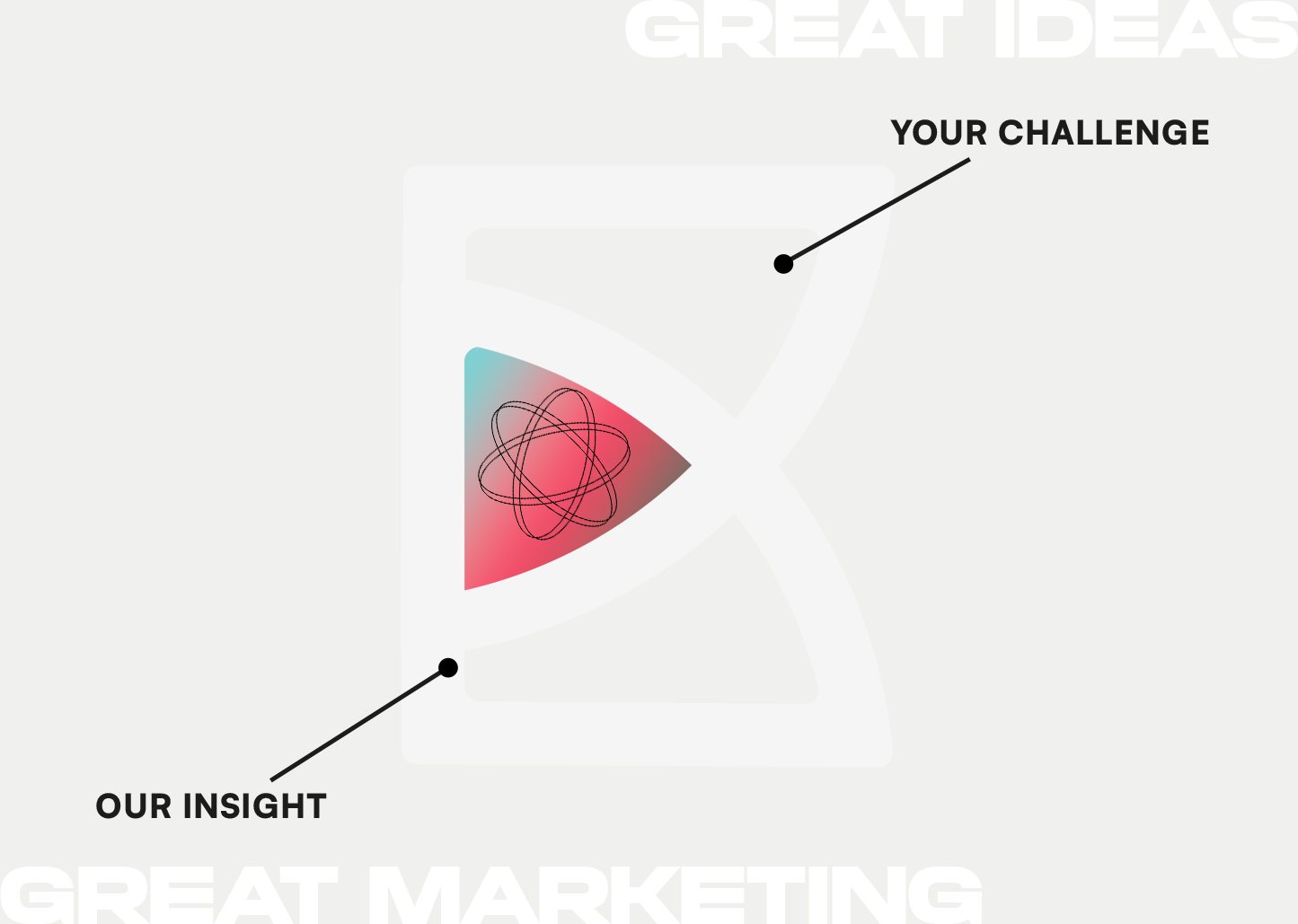
A custom grid and grain-texture background built in Illustrator, Lottie scroll animations, and a full color and type system built from nothing.

The Full Page

Under the Hood
Building a visual system from nothing
There was no existing brand to work from, so the grid, type scale, colour system, and component set were all built before a single section was designed. The grid is a 1440px twelve-column system with 15px gutters, written out as its own stylesheet so the layout rules existed as code and not just as guides in a design file. That order matters on a page this long: deciding spacing and type relationships once, up front, is what keeps nine stacked sections from drifting into nine different-looking pages.
Grain as the thing holding it together
A custom grain texture and a faint grid pattern sit under the whole page, both built in Illustrator, alongside a bespoke illustration set drawn for the four onboarding steps. On a landing page for a category nobody has heard of, flat colour reads as generic template, and the texture is what gives an otherwise clean layout a surface and a point of view.
A narrative arc, not a feature list
Sections are ordered as an argument: hero, the problem with a supporting video, three core benefits, testimonials, features, membership pricing, FAQ, and a closing call to action. A new category has to be explained before it can be sold, so proof sits deliberately between the benefit claim and the price. After the price is too late.
Motion tied to scroll position
The hero animation was built in After Effects and exported to Lottie, so it ships as vector JSON that stays sharp at any size and weighs a fraction of a video file. It fires on scroll, never on a loop. On a page this long, always-running animation competes with reading, and tying motion to scroll means each section animates once, when someone arrives at it.
The Outcome
Shipped in 2023 as a paid landing-page engagement. Every asset was original: the logo marks, the illustration set, the grain and grid textures, the twelve-column stylesheet, and the After Effects source for the hero animation. The craft and structure are the story here, no launch metrics were tracked on this one.