
Tremulant
Visit the live site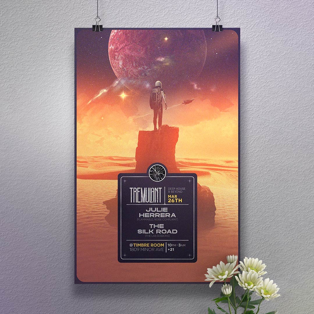
Overview
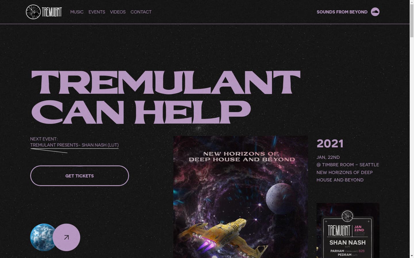
Tremulant is a Seattle underground electronic music series run by Joe Bellingham, hosting shows at Timbre Room and Cherry Seattle with a rotating lineup of touring and local acts.
Platform
- Webflow
Interaction
- Splide
- Lottie
Print & artwork
- Photoshop
- Illustrator
The Problem
A recurring event series needs a visual identity that holds together across dozens of one-off pieces — posters, an album cover, a monthly series — without repeating itself.
Key challenges included:
- Every show needed its own poster, adapted across multiple output dimensions
- The label needed an album cover built from a hand-drawn concept, not a stock template
- The brand needed an evergreen piece — a monthly poster series — to stay visible between events
The Solution
A multi-year design relationship built around one recognizable visual language, applied differently every time.
Event Posters
Recurring, dated posters for individual shows, each adapted to every output size the event needed.
Album Art
A full hand-drawn-to-digital pipeline for the label's album cover: sketch, Photoshop cleanup, Illustrator vector trace, color and shadow pass, then an oil-paint texture finish.
Monthly Poster
An ongoing series built around "cosmic and earthly elements juxtaposed, vintage textural elements" — the throughline across every other piece.
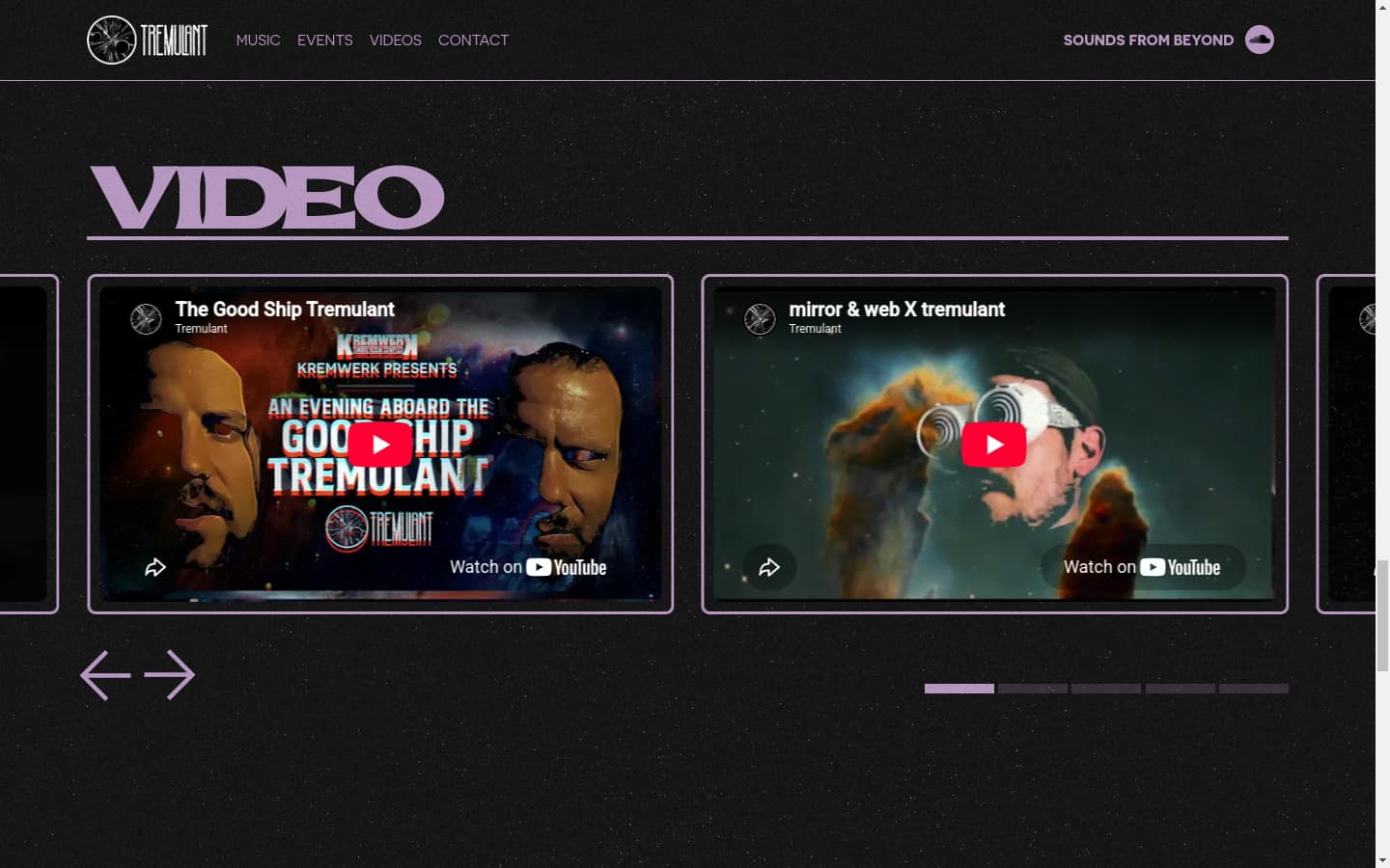
Under the Hood
Hand-drawn to vector, deliberately
The album cover started on paper and ran a full pipeline from there: pencil sketch, Photoshop cleanup, an Illustrator vector trace, a colour and shadow pass, then an oil-paint texture finish over the top. Tracing a real drawing keeps the line weight irregular in a way vector tools do not produce on their own, and the texture pass puts back the surface that vectorising strips out.
One system, many output sizes
Each show poster gets adapted across every dimension the event needs, print, square social, and vertical story, which is a different job from exporting one artwork at three sizes. Composition gets rebuilt per ratio so the type hierarchy survives the crop. A poster laid out for print becomes an unreadable square otherwise.
A throughline across four years of one-offs
Cosmic and earthly elements juxtaposed against vintage textural treatments is the constant, applied differently every time. That is what lets dozens of independent pieces still read as one series without any of them repeating another.
Timeline
- 2021: Relationship begins
- 2021–2024: Recurring posters, album art, monthly series
The Outcome
A four-year working relationship across posters, album art, and a website — the kind of repeat engagement that only happens when the work keeps landing.